
The Link Between The Stock Market and The Business Cycle
How Situational Awareness Can Significantly Boost Portfolio Returns
Market crashes, corrections, and bears are the bane of every investor – with two exceptions. Skilled short-sellers, and investors who are able to tell the difference between market events that are linked to a business cycle turning point, and those that are not. Investors who were fortunate enough to have missed the last two bear markets (2000 & 2008) have significantly higher portfolio returns than those who remained invested throughout. Since both of these market events were linked to recessions, was there a way to know – ahead of time – that getting out of the way was the right move?
Corrections & Bear Markets – The Facts
• A Bear Market is defined by a 20% DECLINE or greater.
• A Correction is a decline between -10% and -19%.
• Since 1960 there have been 5 bear markets and 6 corrections.
• A bear market begins on average every 10 years.
• A correction begins about every 4.5 years.
• The average duration of a bear market is approximately 17 months.
• The average time it takes for the market to fully recover from a bear is approximately 60 months.
The Link
In his classic investment book Stocks For The Long Run, Wharton professor Jeremy Siegel points out that almost without exception, the stock market tops out prior to business cycle peaks, and bottoms out before cycle troughs. Out of the 47 recessions since 1802, 43 of them (9 out of 10) have been preceded (or accompanied) by declines of 10% or more in the stock market. This is the core idea that drives our inquiry into The Link Between The Stock Market and The Business Cycle.
The stock market tops out and begins to decline before the economy rolls over. Lead times vary, but the market can hit its peak as much as a year before the onset of a recession. The recessions of 1980 and 1990 are the exceptions that prove the rule. In these two cases the market gave no warning of an economic downturn approaching.
The stock market is also prone to sounding false alarms. Since 1802, there have been 12 instances where the market fell by 10% or more, but there was no recession within the next 12 months. Perhaps the most infamous episode was the market crash of 1987, where the decline in stocks was so dramatic and severe that there was a nearly universal belief that a recession would soon follow. Alas, it failed to show up.
The average lead time between a stock market top and a business cycle peak is 5.2 months. The average lead time between a market bottom and a cycle trough is 4.8 months. This brings up an interesting question. If one could anticipate, with even a modicum of accuracy, the onset of a cycle peak, would that help investors to protect their portfolios by “getting out of the way” of the recession?
That’s one of the key points of this inquiry, and we will attempt to arrive at some conclusions by studying each of the market events that took place during the four longest economic expansions of the last 50 years.
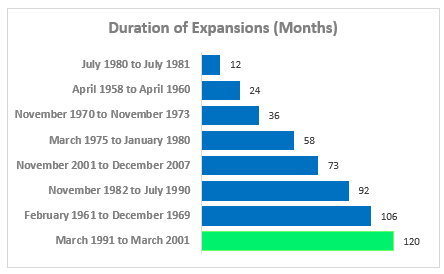
Chart 1. Economic Expansions
One of the topics of greatest interest to stock market historians, is the relationship of the business cycle to the performance of the stock market. The research efforts of Dr. Robert Dieli at NoSpinForecast are focused on the US business cycle. His methodology is based on a model that uses widely known and readily available indicators of macroeconomic and financial activity in a transparent and reproducible manner.
Dr. Dieli’s main forecasting tool, the Enhanced Aggregate Spread [EAS] is designed to provide reliable signals of turning points in the business cycle so that our users can make informed decisions on how best to manage their financial and business affairs.
As you can see on Chart 1, the current expansion is now the longest on record. In this series of articles we will focus on how the stock market has performed in the other four long expansions as we approached the business cycle peak. With the next chart, we begin to build the case for the existence of the link between the stock market and the business cycle.
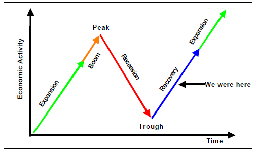
Chart 2. Phases of the Business Cycle
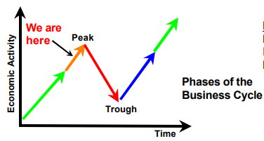
Chart 2 is a schematic diagram of the business cycle. It is not drawn to scale. It performs the same function in our analyses as a compass rose does in the navigation process. Once you know where “north” is, the rest of the process becomes more manageable. Similarly, knowing where you are in the business cycle gives you important information about what to expect now and in the months and years ahead.
Which brings us to the first general concept that underlies our research: “where are we and how did we get here? “ That knowledge will inform how we interpret information as it becomes known.
The second general concept that underlies our research: “what did they know and when did they know it? “ Or WDTK for short. When doing historical analyses, with the benefit of hindsight, it is often easy to forget that much of what is known to us now was unknown at the time. This is especially true of the analysis of the interaction between variables. So, as we proceed with our review keep in mind that we will be focusing on what was known then rather than what we know now.
Chart 3. Enhanced Aggregate Spread [EAS]
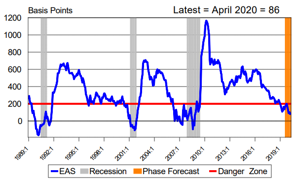
The location of the “we are here” (or in the case of the historical charts “we were here”) arrow on chart 2 is based on the readings we obtain from chart 3. Plotted here are the values of the Enhanced Aggregate Spread [EAS] with a nine month lead. The area you see in green on this chart is forecast horizon of the EAS. The reason why it is green has to do with the colors of the arrows you saw on chart 2. The gray zones are the official recession periods as designated by the National Bureau of Economic Research.
As you see here, the EAS dipped below the 200 Basis Point level ahead of the onset of the last three recessions. And, as it did so, we moved the arrow on the schematic out of the expansion phase and into the boom phase of business cycle. When and how we did so was based on what we learned from our set of coincident indicators.
But the process in every case was the same. First, what did the EAS tell us to expect? Second, when were those expectations confirmed?
As important as it was to know when a recession might start, it was even more important to know when a recession would end. And so, as the EAS moved back above the 200 Basis Point line we changed the location of the arrow on the schematic from the recession phase of the cycle to the recovery phase of the cycle.
Chart 4. Aggregate Spread – Forecast Summary
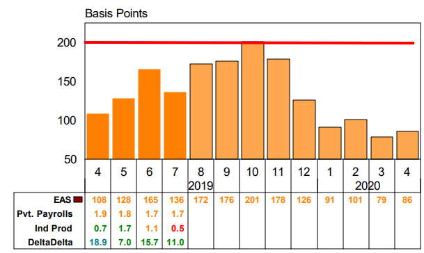
Pvt. Payrolls is the % change from year ago in Total Private Nonfarm Payroll Employment.
Ind Prod is the % change from year ago in the Index of Industrial Production.
DeltaDelta is the % change from year ago in S&P500 Stock Index, minus the % change from year ago in the Unemployment Rate.
Chart 4 expands the forecast horizon section of the prior chart to allow us to examine the interaction between the leading indicator and the coincident indicators. The three series you see on the table, along with the values that they take on during recessions provide the evidence we use to move the “we are here” arrow on the schematic.
As of this writing, the EAS is running at a level that suggests that the expansion phase will persist through August of 2016. It is telling us to expect readings from the coincident indicators that will be above their recession associated levels. My shorthand for this configuration is a “green board”.
This is the chart (chart 4) that tells us “where we are”, “how we got here” and “what we know“. We will be using this chart in each of the stock market episodes we will be examining in the rest of this report.
Chart 5. Standard & Poor’s 500 Stock Index With Zone of Death Parameters
The reason why we said we thought it was just as important to know when a recession was ending as it was to know when one was starting is seen on chart 5. You can see that during all of the recessions the stock market has suffered significant declines. But, as you can also see, some of the largest gains have occurred in the periods immediately following the end of the economic downturn. In other words, knowing where the boom ends is just as important as knowing where the recovery starts.
Another lesson the chart offers is the fact that not every decline in the stock market is associated with the onset of a business cycle peak. Put differently, the link between the Stock Market and The Business Cycle is strong on a long-term basis but weaker on a short-term basis.
Which brings me to the first general conclusion of this study: It is almost as hard to forecast the business cycle using the stock market as it is hard to forecast the stock market using the business cycle. The two are connected, but the lines of causality are blurred.
The red and the green lines on the chart mark the -10% and +10% levels. I call the space between them the Zone of Death. So named because the line tends to traverse the gap fairly quickly in both directions. We will be using the information about the Zone of Death in the charts we will be looking at with each of the stock market episodes.
Chart 6. S&P 500 Stock Index During The 106 Month Expansion from 1961 to 1969
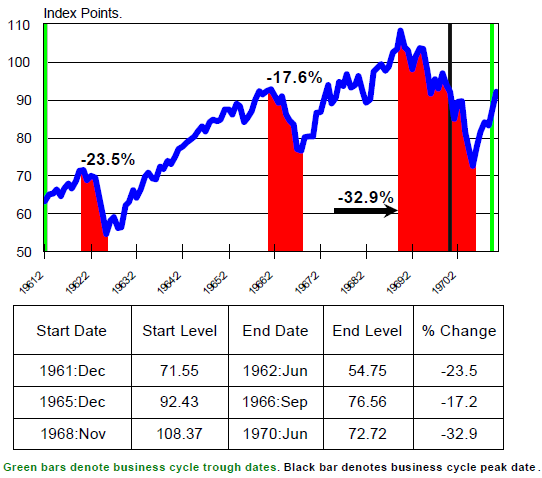
The “industry standard” for classifying stock market declines is to divide them into two events. The first, called a “correction”, is a decline of at least 10% from the previous high. The second, called a “bear market” is a decline of at least 20% from the previous high. On this chart, you see one correction and two bears.
The calculation of the size of the moves in this presentation is based on the month-end closing price of the S&P 500 stock index. If we were to use the daily closes, the correction you see in the middle of the chart would actually turn out to be a bear market since the highest high and lowest low occurred inside of the dates we used for the calculation you see.
In the next few charts we focus on each of these 3 market events individually.
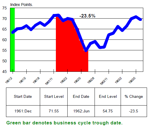
Chart 7. Bear Market of 1961
Where We Were In the Business Cycle
Our first task is to establish where we were in the business cycle. To do that we use our knowledge of the actual business cycle peak and trough dates as established by the National Bureau of Economic Research [NBER] and the information we can glean from the level and trend of the Enhanced Aggregate Spread [EAS].
We will open the review of each of the events with this chart. And, as you see in the text that follows, it is here that we will provide you with some of the background about what was going on in the market. This will begin the process of establishing the link between The Stock Market and The Business Cycle.
The Kennedy Slide of 1961-1962
From December 1961 to June 1962, the S&P 500 lost 22.5%. This event came to be known as the “Kennedy Slide” because it occurred during President John F. Kennedy’s term.
The trouble began after a big run-up in the market that lulled investors into a dangerous state of complacency. After rising 27% between January and December, suddenly – and without warning – the rally “broke.” Some historians refer to this event as the “market break of 1962.” Pundits at the time blamed the decline on excessively high valuations and earnings warnings from a few high-fliers like Texas Instruments and Polaroid.
Chart 8. Bear Market of 1961 – S&P 500 Stock Index
But market historians also point to investor anxiety over the escalating tensions between the U.S. and the Soviet Union. The construction of the Berlin Wall divided East and West Berlin. The wall became a powerful symbol of Soviet military aggression in Europe.
Then in November 1961, President Kennedy initiated the CIA’s Operation Mongoose, authorizing covert attempts to overthrow Fidel Castro’s communist regime in Cuba. Operation Mongoose was a failure and pushed Castro closer to the Soviet Union. This eventually led to the Cuban Missile Crisis in October 1962.
Fear spread quickly in 1962. Crowds of anxious investors gathered outside of the Big brokerage offices, where wall-mounted boards displayed market prices. “It was standing room only at Merrill Lynch, Pierce, Fenner & Smith,” reported the Wall Street Journal.
Chart 9. Bear Market of 1961 – S&P 500 with Associated Indicators
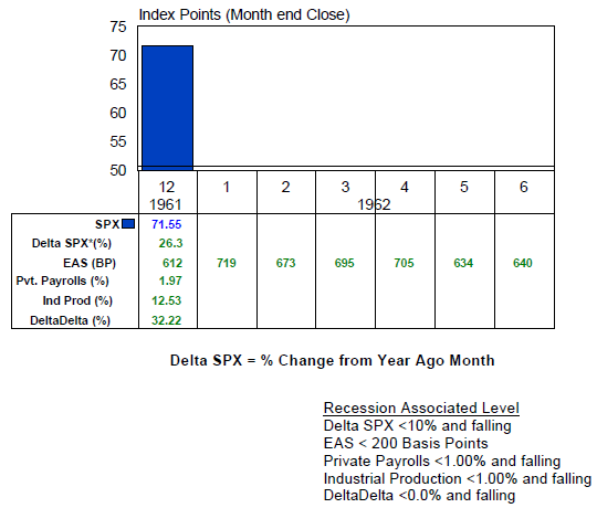
In December of 1961 we “knew” two things. The first was the level of the S&P500. The second was the level and trend of the EAS for the next nine months. On this chart we are only going out six months, because that was the length of the bear market we are examining.
The key point to keep in mind here, and all the other charts like this one, is that we are always doing the analysis in terms of “what did they know and when did they know it,“or WDTK.
As we noted earlier, a chart that has the EAS in this configuration is what we are calling a “green board”.
Chart 10. Bear Market of 1961 – S&P 500 with Associated Indicators
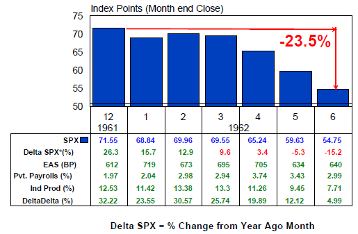
Over the next six months we see the decline in the stock market, and how the rest of the indicators performed. We would have learned two things: First, the forecast made by the EAS of more green numbers was completely accurate. So, we know that the stock market decline we see here is not associated with a business cycle peak.
Second, the strength shown by the employment and production numbers strongly suggest that the economy was gaining steam, which is what we would expect this close to the last cycle trough. By the end of June 1962, the market decline had run its’ course. Stocks began a new multi-year rally.
Conclusion
Because we had a green board throughout this stock market event, it turned out to be a buying opportunity. When we have a red board, it’s time to play aggressive defense.
In the next chapter of this report we will move on to the next major market event: the Bear Market of 1966. We will continue to build the case for establishing the link between the stock market and the business cycle.
Great article! I agree with everything you are saying. The link is real.