

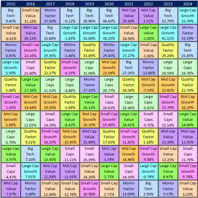
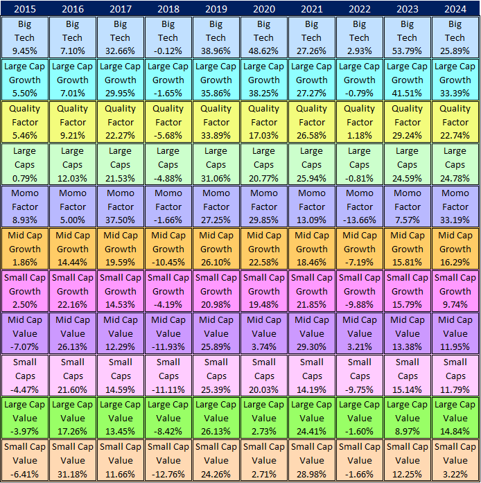
Many of you have seen these charts, or variations of them, before. The first time I saw it, I remember being a little overwhelmed. It contains a large amount of information, and the color scheme can be blinding at first. But I believe it's worth your while to sit with this chart and try to get comfortable with what it reveals about asset class returns, randomness, and the importance of diversification.
One of the things these charts illustrates (and may be it's original purpose) is the wide variation of annual returns among asset classes, styles, and factors. These charts allow you to visualize the interaction of various slices of the markets. There are certain patterns in the relationships that emerge when you scan from left to right and top to bottom. If you haven't seen these charts before, I suggest that you approach them in the following way.
Columns first, then rows
Start by scanning the far-right column, which shows how each asset class has performed in the most recent period. Forget everything else for now, and just scan this column. You can see how much variability there is among asset class returns.
Next, scan the rows to see how the winning classes become losers and the losers become winners as the years go by. That's why it's important to make periodic adjustments to your mix of assets over time.
Why I chose these assets
There are 10 asset classes and 11 different styles and factors in the charts but there are many more available to investors. I chose these because they are the primary building blocks for any portfolio. In aggregate, they account for ~92% of the global capital market.
Mean Reversion
Another important concept that these charts illustrate is mean reversion. Notice how the best performing asset class in one year is often one of the worst performers the following year. That's mean reversion at work.
I update these charts frequently but not on a specific schedule. For that reason, I recommend that you check back from time to time to see what's going on underneath the headline returns for the major indexes. It could give you some insight into how you allocate your funds among these groups of assets.