
My personal market dashboard is invaluable to me. It’s both my GPS and my BS detector. I designed it in a way that forces me to confront the facts on the ground, so that my writing doesn’t drift too far from reality.
A little backround
I have been captivated by the capital markets since I was 10 years old. I used to sit with my father at the breakfast table every Saturday morning, while he perused the stock market section of the Chicago Tribune.
I don’t know why I was fascinated by the market, but I’m sure it had something to do with a 10 year old boy’s belief that his father knows everything about everything, and if HE is interested in something, it must be very important.
Visualization is helpful, as long as you know what you’re looking for.
I use a lot of charts, graphs, and tables when I write articles or make presentations to clients. I guess it’s part of my learning style, so visuals are part of my vocabulary. I’m often asked which data I find the most relevant and useful in my daily routine. So I decided to share a couple of examples of the things I find interesting, and useful.
If you are a regular visitor to ZenInvestor you have probably seen a few of these visuals before. I have a mosaic of them that I look at every week, if not more often. An individual picture has little value on its own, but when taken together they give me a sense of what’s going on in the vast universe of the global capital markets.
Why I focus on some things and not others
If I had to pick which areas of investing I know the most about, it would be:
- bear market forecasting
- recession forecasting
- behavioral economics
- critical thinking
(In that order.)
Let’s get to the dashboards already
With that in mind, this is the dashboard that greets me every morning. (These charts and tables update automatically at the end of every trading day.)
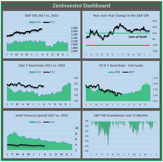
As you can see, I’m interested in what various asset classes are doing this year, as compared to last year. I’m also an avid student of market history, going back to the 1800s, but that has limited value for what I’m trying to understand in the present.
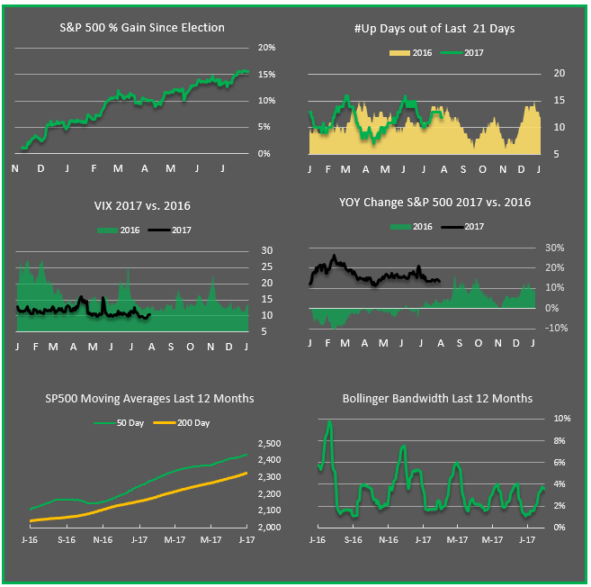
Secondary, but still critical, visuals
Next is a series of visuals that give me clues about how strong or weak the current market trends are. Market trends can be quite durable, in which case I want to go with the flow. But they can also be overdone, in which case I may want to fade the trend.
I’ve shared two of the dashboards that I use in my own pursuit of what’s happening now, and what may be coming around the corner. I also have dashboards that summarize what’s happening in the economy, especially with regard to the onset of the next recession.
I am a capital markets geek
You’re already thinking it, so you might as well say it. I’m a capital markets geek. And I’m proud of it. It’s been said that everyone has something in their life that they are destined to be good at. For me, it’s the challenge of understanding the ebb and flow of the economy and the markets, so that I can inform my clients and readers about when to be aggressive, and when to circle the wagons.