Using the S&P 500 as my data set, I found that the 7 largest companies by market cap have generated more than half of the 25.1% year-to-date return for the index. Microsoft, Apple, Google. Amazon. Tesla, Facebook, and Nvidia are responsible for 52.6% of the total wealth created by all 500 companies combined.
How much wealth has been created by the 500 companies in the S&P 500 so far this year? $10.6 Trillion, give or take. That means our top 7 names put about $5.6 Trillion into the pockets of their fans. (Well, at least on paper. Those who took profits on the way up left some money on the table.)
Table 1. S&P 500 stats by size rank
Size Rank | Total % of Index | Average P/E | Average Market Cap (000) | Average YTD Return |
|---|---|---|---|---|
Top 7 | 27.5% | 78.50 | $1,657,100 | 56.9% |
Top 20 | 39.8% | 52.80 | $839,845 | 33.4% |
Next 480 | 60.2% | 35.90 | $52,426 | 13.4% |
The next three charts show how dominant the top 7 S&P 500 stocks have been this year. (The charts say "Top 5" but I expanded the list to the top 7 names for this article.)
In these charts I divide the market into groups that share certain characteristics, like growth vs. value, large vs. mid vs. small caps, and cyclical vs, defensive, etc. The idea is to gain some perspective about which parts of the market are on the rise and which are in decline.
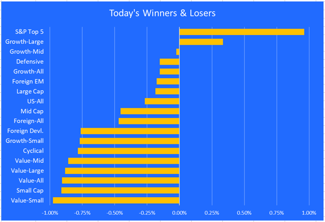
I'll start with a snapshot of just today's action (November 19, 2021). I'll then show the same chart, but with a one-week frame. I'll end with the year-to-date chart. Here's the chart from just today.
Chart 1. Today's performance by category
The top 7 stocks by market cap dominated the market on Friday, and dragged the rest of the large cap growth category with them. Small caps and value stocks took a beating.
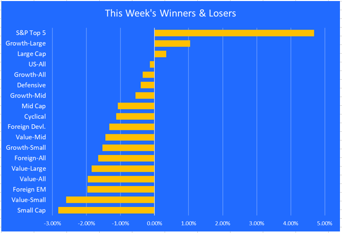
Chart 2. This week's performance by category
It's the same story when we widen out to one week.
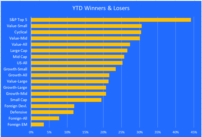
Chart 3. Year-to-date performance by category
Year-to-date, the top 7 stocks still dominate, but small and mid caps are doing well. Value is ahead of growth, and cyclical stocks are trouncing defensive stocks.
Emerging markets came in last, but if we exclude China the results improve dramatically. There is an ETF that covers emerging markets without china - EMXC.
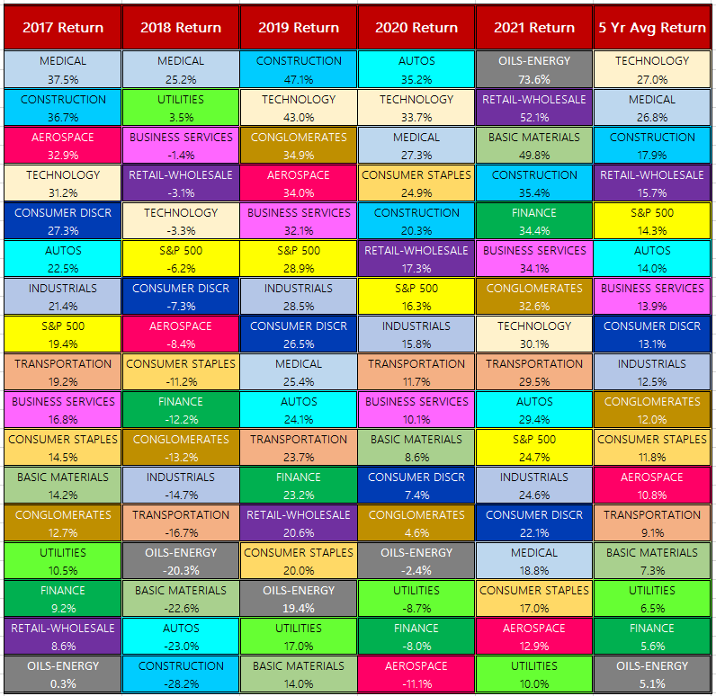
Table 2. Periodic table of S&P returns by sector.
This table offers a way to track the relative performance of each S&P 500 sector over time. Tech is the top sector, thanks in large part to the top 7 stocks in the index. Energy has been red hot this year but it still landed at the bottom of the 5-year column.
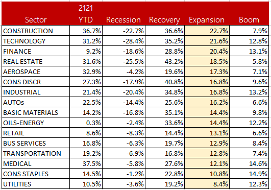
Table 3. Sector performance during each phase of the business cycle.
As the economy moves from recession to recovery, and from expansion to boom, this table shows how each sector has performed. Since we are now in the expansion phase, I sorted the table accordingly.
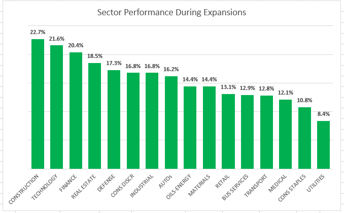
Chart 4. Sector performance detail during expansions.
Here is another way to view the data from the above table.
Final thoughts
One of the ways to find value in a top-heavy and over-valued market is by looking at the sectors that have performed well in the next phase of the business cycle.
In today's environment, that means slowly and gradually reducing some of your exposure to growth names, and especially big tech names, and adding to more defensive sectors like healthcare and consumer staples.
By doing this gradually, you will be ahead of the curve when the business cycle transitions from expansion to boom. Nobody knows when that will happen, but it will happen eventually.

Nice way to find needles in an overvalued haystack. As always good insights Erik!
Thank you, Pranay.